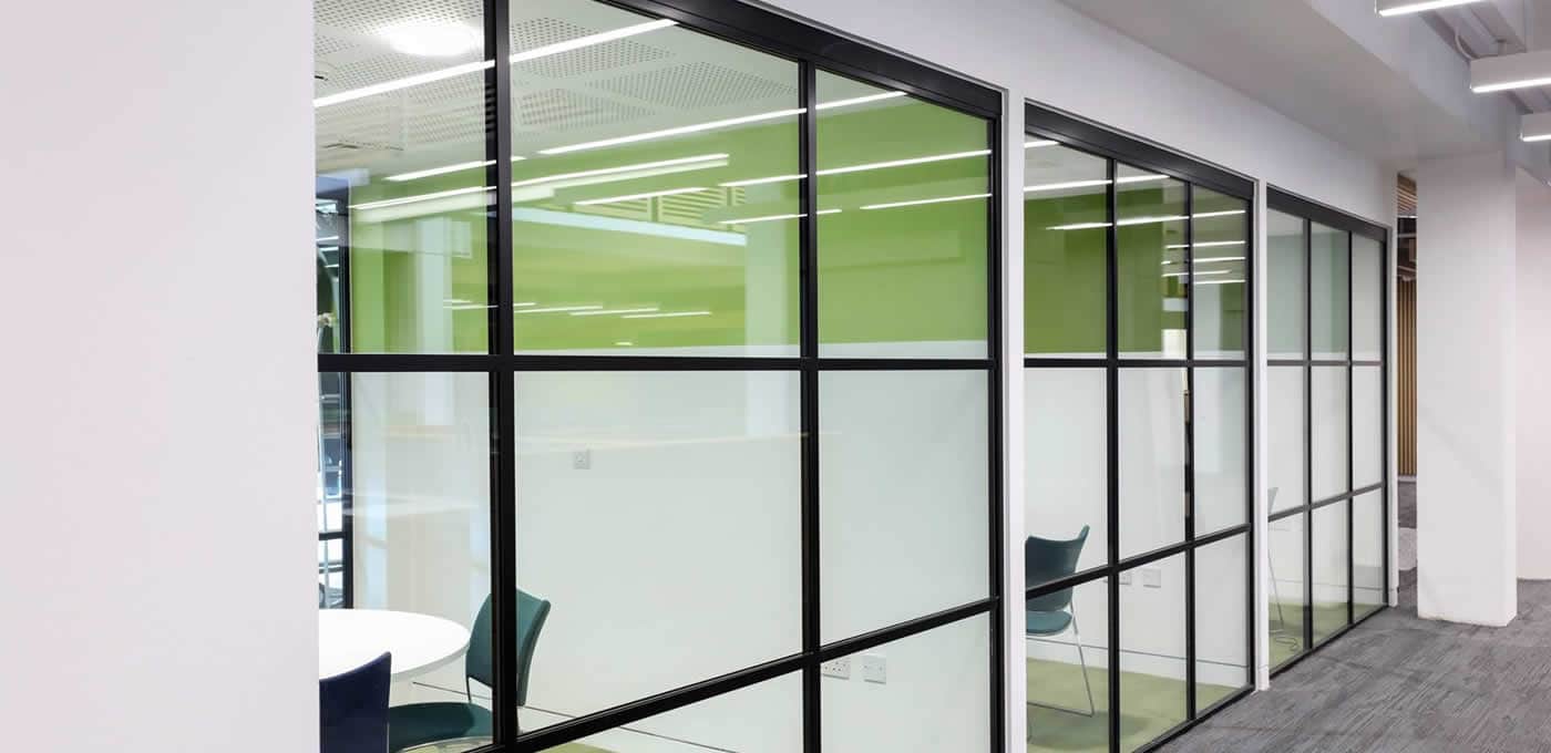
The colour of your office affects your productivity, even if you don’t realise it. If your office walls are painted dull grey – the colour of warships – it’s time for a makeover. Studies[1] have shown that bland grey, beige and white offices induce feelings of sadness and depression. Colours don’t just change our moods, they also profoundly impact our productivity. Research by The Centre for Health Design shows that white office walls affect our focus since they resemble “clinical” settings and give off “eerie” vibes. So, if you’ve been having trouble getting work done in your everything-white office recently—well, you just might be able to blame those bland walls. Decorating your office space with vibrant, stimulating hues that increase output and spark creativity is not difficult at all.
Chromology, the psychology of colour, has been used by companies for years to improve the moods and reactions of their customers and workers, in turn improving their business goals.
Depending on your business, choosing different hues can help achieve different things. For example, choosing the right colour can help you be more productive, trigger feelings in your customers that can in turn support sales, or even improve the opinion potential customers have of you before they try your product or service.
Blue & Green
Two of the most common colours in Mother Nature’s palette: restful green and calming blue improve efficiency and focus. They also give an overall sense of well-being. Blue stimulates the mind. Strong blues clear thought while soft blues aid concentration and have a calming effect. It has been found that this calming effect comes from stimulating natural tranquillizers in the brain. Green is associated with positive emotions and is found to be soothing. If your business is one that usually makes people nervous, decorating with a pleasing shade of green can help customers feel more comfortable. And if you want happier, more effective workers, green and blue are wise choices.
Red
Red is active, intense and alarming at times. The passion-inspiring colour increases the heart rate and blood flow upon sight. It stands out and grabs our attention. This is why it is universally used for traffic lights and stop signs around the world. That said, if there’s something in the office you want to urgently draw employees’ eyes to, it’s best to paint it red.
Yellow
Mellow yellow, often viewed by colour psychologists as the shade of optimism, is energetic and fresh. It is believed to trigger innovation and is best used in work environments where artists, writers, designers, developers and other creative professionals work.
Check out the infographic from Taskworld below to discover the best colour for your line of work.

[1] https://www.researchgate.net/publication/229586737_Work_week_productivity_visual_complexity_and_individual_environmental_sensitivity_in_three_offices_of_different_color_interiors


